Discovering the perfect colours to enhance your natural radiance can transform not only your appearance but also your confidence. Understanding which hues complement your unique skin tone isn’t merely about following fashion trends—it’s about creating harmony between your complexion and the colours you choose to wear. When you select shades that naturally flatter your undertones, your skin appears clearer, your eyes seem brighter, and your overall appearance gains a luminous quality that transcends seasonal fashion changes.
Professional colour analysis has revealed that certain pigments interact with melanin deposits in remarkably predictable ways, creating either harmony or discord with your natural colouring. The science behind colour theory extends far beyond aesthetic preferences, delving into how light wavelengths interact with your skin’s unique chromatic composition. By mastering these principles, you can curate a palette that consistently enhances your complexion, making colour selection an effortless process rather than a guessing game.
Understanding undertones: warm, cool, and neutral skin classifications
The foundation of successful colour matching lies in understanding your skin’s undertone—the subtle hue that exists beneath your surface skin colour. Unlike your overtone, which can change due to sun exposure, hormonal fluctuations, or environmental factors, your undertone remains constant throughout your lifetime. This chromatic signature acts as your personal colour compass, guiding you towards shades that create natural harmony with your complexion.
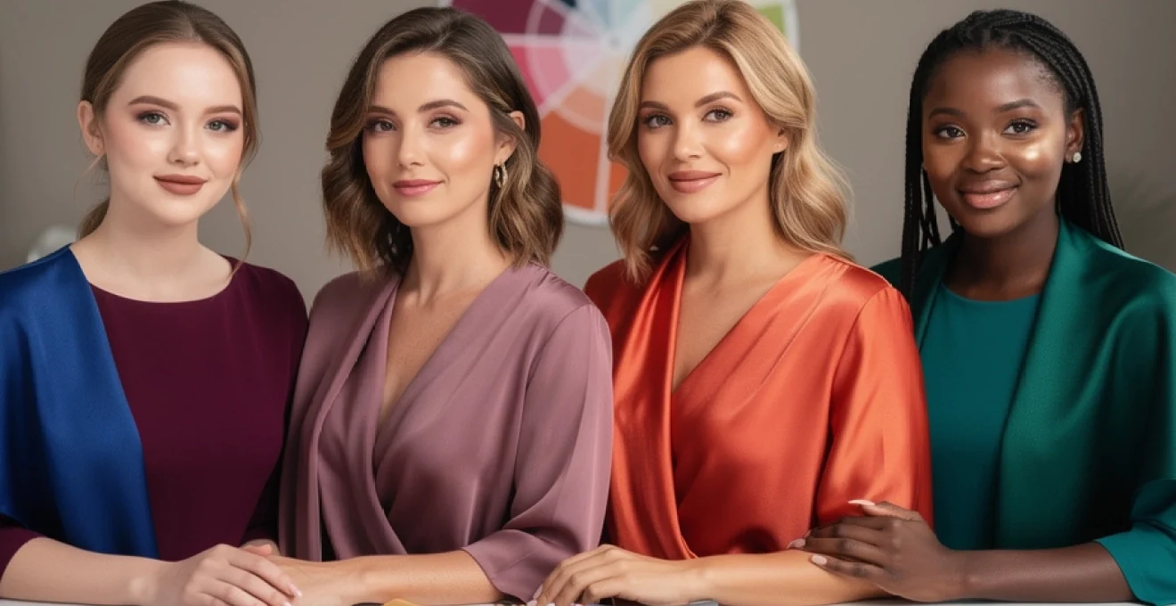
Professional colour analysts categorise undertones into three primary classifications: cool, warm, and neutral. Cool undertones feature blue, pink, or violet pigmentation beneath the skin’s surface, whilst warm undertones display golden, yellow, or peachy hues. Neutral undertones present a balanced combination of both cool and warm characteristics, creating versatility in colour selection but requiring careful analysis to identify the subtle leanings that influence optimal colour choices.
Identifying cool undertones through blue and pink pigmentation
Cool-toned individuals possess undertones that lean towards the blue end of the colour spectrum, manifesting as pink, rose, or violet pigmentation beneath the skin’s surface. These undertones create a natural affinity for colours that share similar chromatic properties, whilst clashing with overly warm or golden hues. The identification process requires careful observation under natural lighting conditions, as artificial illumination can mask these subtle undertones.
Several reliable indicators signal cool undertones: veins appearing distinctly blue or purple when viewed on the inner wrist, a tendency to burn rather than tan when exposed to sunlight, and a natural harmony with silver jewellery that makes the complexion appear brighter and more vibrant. Cool-toned skin often responds poorly to warm foundations, appearing ashen or unnatural when yellow-based products are applied.
Recognising warm undertones via golden and peach melanin deposits
Warm undertones manifest through golden, yellow, or peachy pigmentation that creates a natural luminosity within the skin. These individuals typically possess melanin deposits that reflect light in ways that favour earth-toned and golden colour families. The warmth in their skin creates an inherent compatibility with colours that share these golden characteristics, whilst cool-toned shades can appear harsh or draining against their natural colouring.
Key indicators of warm undertones include veins that appear greenish when examined under natural light, a propensity to develop a golden tan rather than burning in sunlight, and an enhanced appearance when wearing gold jewellery. Warm-toned individuals often find that cool-based foundations appear too pink or ashy against their skin, highlighting the importance of selecting cosmetics with yellow or golden undertones.
Neutral undertone assessment using mixed pigmentation analysis
Neutral undertones represent a balanced combination of both warm and cool characteristics, creating unique challenges and opportunities in colour selection. These individuals possess neither distinctly warm nor cool pigmentation, instead displaying a harmonious blend that allows for greater flexibility in colour choices. However, this versatility requires careful analysis to determine which direction the neutrality leans, as most neutral undertones have subtle warm or cool tendencies.
Neutral-toned individuals often find that both gold and silver jewellery appear flattering, though one may show a slight preference. Their veins may appear blue-green or change appearance under different lighting conditions
and they may notice that their skin neither burns easily nor develops an intense golden tan. When performing the classic white paper test, neutral undertones will not reveal a strong pink or yellow cast; instead, the skin appears balanced, sometimes with a soft beige or olive quality. For these individuals, the colours that brighten the complexion most effectively tend to be mid-intensity shades—neither extremely cool nor extremely warm—that mirror this chromatic equilibrium. Experimenting with slightly cooler and slightly warmer versions of a favourite hue is often the most accurate way to determine which direction a neutral undertone subtly leans.
Professional colour analysis techniques with natural lighting
Whilst at-home tests offer valuable clues, professional colour analysis provides a more precise evaluation of your undertone and ideal brightening colours. Certified colour consultants typically perform a draping session in natural daylight or full-spectrum lighting, placing calibrated fabric swatches beneath your face to observe how different hues interact with your skin. Rather than relying on the subjective appearance of a single area, they assess multiple facial zones—such as the cheeks, under-eye area, and jawline—to determine which colours create lift, clarity, and luminosity.
Professionals also consider secondary factors such as eye pattern, natural hair pigmentation, and overall contrast level between your features. Increasingly, AI-assisted tools and high-resolution photography are being used to support these observations, offering objective data on how specific wavelengths of light reflect off your skin. This combination of technical analysis and trained visual assessment allows for a nuanced, personalised colour palette that goes far beyond generic “warm” or “cool” labels. The result is a curated set of clothing and makeup shades designed to consistently brighten your complexion in everyday life.
Colour theory applications for complexion enhancement
Once you understand your undertone, the next step is to apply colour theory to enhance your complexion in a strategic way. Colour theory explains how different hues interact on the colour wheel and how those relationships influence visual impact on the skin. When used thoughtfully, these principles can turn your wardrobe, makeup bag, and even hair colour into tools that visibly illuminate your face. Rather than guessing which tones will brighten your complexion, you can use structured methods to create harmonious, flattering combinations.
Complementary colour wheel principles for skin brightening
Complementary colours sit opposite each other on the colour wheel and create the strongest contrast when paired together. On the skin, this contrast can be either energising or overpowering, depending on how it is handled. For complexion brightening, we use a softened version of complementary contrast: hues that sit near-opposite your dominant undertone help neutralise sallowness or redness while making your natural colouring appear clearer. Think of this as using contrast to sharpen the image of your face, much like adjusting the sharpness setting on a screen.
For example, if your skin leans ruddy or pink (a cool undertone characteristic), cooler greens and teal-based shades in clothing can visually balance that redness and make your complexion look more even. Conversely, if your skin appears sallow or yellow, berry tones, blue-based reds, and cool purples offer a flattering counterpoint that restores vibrancy. In makeup, green-tinted primers for redness and peach correctors for blue under-eye circles are direct applications of this complementary principle. The key is to choose softened, wearable versions of opposite colours rather than intense, high-saturation hues that may dominate your features.
Monochromatic colour schemes for tonal harmony
Monochromatic colour schemes build an outfit or makeup look around variations of a single hue, using lighter, darker, or muted versions to create depth. On the complexion, this approach can be exceptionally brightening because it reduces visual “noise” and allows your natural features to stand out. When everything in your look gently echoes your undertone, the overall effect is polished and harmonious, similar to hearing a well-tuned chord in music rather than clashing notes.
For cool undertones, a monochromatic scheme might involve soft berry lips, a rose-toned blush, and a dusty mauve top. Warm undertones might glow in a palette of apricot blush, warm nude lipstick, and a camel or terracotta blouse. Neutral undertones can explore taupes, greige, and soft mocha families to create a cohesive, understated radiance. Because monochromatic styling relies on subtle shifts within the same colour family, it is particularly effective for work settings or minimal makeup days when you want to look naturally refreshed rather than overtly styled.
Analogous colour combinations for subtle enhancement
Analogous colour schemes combine hues that sit next to each other on the colour wheel—such as blue, blue-green, and green—to create soft, visually cohesive looks. These combinations are especially useful when you want to brighten your complexion without dramatic contrast. Because analogous shades share similar undertones, they tend to blend seamlessly with your natural colouring, providing a gentle lift rather than a bold statement.
If you have cool undertones, wearing a combination of navy, teal, and soft emerald near your face can enhance the clarity of your skin while making your eyes appear brighter. Warm undertones may benefit from trios like coral, peach, and soft amber, or mustard, olive, and warm brown. For neutral skin, analogous combinations anchored in mid-tone shades—such as rose, dusty mauve, and plum—maintain balance while still adding dimension. Think of analogous colours as a gradient sunset rather than a sharp horizon line: everything flows, and your complexion becomes part of that gentle transition.
Triadic colour selection for dynamic contrast effects
Triadic colour schemes use three hues spaced evenly around the colour wheel, producing lively but balanced contrast. On paper, these combinations can look bold, but when translated into clothing and makeup, they can be softened to create sophisticated, complexion-enhancing looks. A thoughtfully chosen triadic palette frames your face with energising colour while still keeping your natural features in focus.
For instance, a cool-undertone triadic combination might incorporate a cobalt blouse, subtle coral lipstick, and a small mustard accessory—only one of these appears close to your face, but the others support the overall vibrancy of your look. Warm undertones might glow in a palette of teal, tomato red, and golden yellow, using the most flattering colour nearest the face and the others as accents. Triadic colour selection is particularly effective for events, presentations, or occasions when you want your complexion to look bright and your presence to feel dynamic without appearing overly theatrical.
Cool undertone colour palettes: berry tones and jewel shades
Cool undertones tend to look most luminous in colour palettes anchored in blue, pink, and violet bases. To brighten a cool-toned complexion, focus on berry tones and jewel shades that mirror the clarity and depth of your natural pigmentation. These colours interact with the blue and pink in your skin to create a lit-from-within glow, rather than fighting against it. The result is smoother-looking skin, brighter eyes, and, often, the optical effect of whiter teeth.
Clothing in hues such as sapphire blue, emerald with a cool cast, amethyst, raspberry, and true cobalt will generally lift a cool complexion. For softer looks, icy pastels like lavender, powder blue, and cool blush pink offer brightness without intensity. In makeup, blue-based red lipstick, cool rose blush, and taupe or charcoal eyeshadows tend to be especially flattering. If you ever notice that warm orange, mustard, or tomato red makes your skin look tired or emphasizes redness, that is your cue to return to these cool, clear shades that naturally harmonise with your undertone.
Warm undertone colour selection: coral, peach, and amber spectrum
Warm undertones come alive in colours that echo the golden, peach, and amber notes within the skin. To brighten a warm-toned complexion, prioritise shades that look as though they have been touched by sunlight: coral, apricot, terracotta, warm olive, and amber-infused neutrals. These hues reinforce the natural warmth of your melanin, much like placing a painting under the correct gallery lighting to reveal its depth and detail.
In your wardrobe, look for soft ivory rather than stark white, camel instead of cool grey, and earthy greens such as moss or olive instead of icy teal. Accents of marigold, rust, and burnt orange can be extremely brightening when worn near the face, provided the saturation level matches your personal colouring (lighter skin often suits softer versions; deeper skin can carry more intense tones). For makeup, peach or coral blush, warm nude or brick-red lipsticks, and golden or bronze eyeshadows tend to create an immediate healthy glow. If cool fuchsia, icy pink, or blue-based purples make your skin look dull or washed out, shifting into the coral and amber spectrum will usually restore vibrancy.
Seasonal colour analysis: draping techniques and professional assessment
Seasonal colour analysis refines the concept of undertones by organising individual colouring into four archetypal groups: Spring, Summer, Autumn, and Winter. Each season corresponds to specific combinations of undertone (warm or cool), value (light or deep), and chroma (soft or clear). Professional analysts use draping techniques—placing calibrated seasonal fabrics around your shoulders—to determine which palette causes your complexion to appear brighter, smoother, and more even. Rather than guessing based solely on hair or eye colour, this method evaluates how your skin reacts in real time to different hues.
During a draping session, you will typically see immediate changes as certain colours reduce shadows, soften lines, and make your eyes stand out, while others emphasise redness, sallowness, or under-eye circles. The process is comparative: you are not assessing each colour in isolation, but observing which group of shades consistently flatters you most. This systematic approach often confirms subtle impressions you may already have—such as “I always feel good in teal” or “beige makes me look tired”—and translates them into a structured palette you can rely on when shopping or planning outfits.
Spring palette characteristics: clear and warm chromatic properties
Spring palettes are defined by warm undertones combined with light to medium value and clear, bright chroma. Imagine the colours of a sunlit garden in early spring: fresh grass, clear turquoise sky, warm daffodil yellow, and bright coral blossoms. Individuals in the Spring category usually have golden or peachy undertones, lighter hair (from golden blonde to light warm brown), and eyes that appear clear and bright—often blue, green, or light hazel.
To brighten a Spring complexion, prioritise luminous, warm colours such as apricot, salmon, coral, warm turquoise, light teal, and golden yellow. Neutrals should lean soft and warm: ivory, light camel, and warm beige outperform stark white or cool grey. In makeup, peach blush, coral lipstick, and warm brown or gold eyeshadows typically create an instant radiance. Heavy, dark, or muted shades—like charcoal, burgundy, or dusty olive—can overshadow Spring colouring, so it is best to reserve them for small accents, if at all, rather than main pieces near the face.
Summer colour profile: muted cool-toned specifications
Summer palettes feature cool undertones combined with light to medium depth and soft, muted chroma. Think of the hazy tones of a beach at dusk or a misty morning landscape: powder blue, dusty rose, soft lavender, and cool taupe. People with Summer colouring often have skin that reads rosy-beige or cool ivory, hair that ranges from ashy blonde to medium ash brown, and eyes in shades of soft blue, grey, or cool hazel.
To brighten a Summer complexion, choose colours that are cool yet gentle—nothing too stark or overly saturated. Flattering shades include powder blue, periwinkle, soft raspberry, dusty mauve, sage, and cool navy. Ideal neutrals are rose-beige, cool taupe, and soft grey; pure black can be too strong, whereas charcoal offers a more harmonious alternative. In makeup, blue-based pink lipsticks, berry stains, and cool rose blush bring a natural freshness. Extremely warm or neon tones—such as bright orange or lime—can compete with Summer softness, making the skin appear blotchy or drained.
Autumn classification: rich warm earth tone applications
Autumn palettes combine warm undertones with medium to deep value and rich, muted chroma. Picture a forest in late autumn: burnt orange leaves, deep olive foliage, cinnamon bark, and golden fields. Individuals in this category typically have golden-beige to deep bronze skin, hair ranging from warm brown to auburn or dark copper, and eyes in shades of warm brown, green, or topaz.
To brighten an Autumn complexion, embrace the full spectrum of earth tones: rust, terracotta, mustard, deep olive, warm teal, and chocolate brown. These colours amplify the natural richness in your skin rather than competing with it. Neutrals like cream, camel, espresso, and warm khaki are far more illuminating than stark white or icy grey. In makeup, brick-red or terracotta lipsticks, warm apricot or copper blush, and bronze or moss eyeshadows add depth and glow. Cool pastels, icy blues, or fuchsia tones often appear discordant on Autumn skin, emphasising shadows or dullness instead of vibrancy.
Winter colour analysis: high contrast cool-toned combinations
Winter palettes are defined by cool undertones, significant contrast, and clear, highly saturated colours. Imagine a snowy landscape with an inky night sky, bright holly berries, and deep evergreens: pure white, jet black, true red, royal blue, and emerald. People with Winter colouring often have very light or very deep skin, dark hair (brown to black), and eyes that appear vivid—deep brown, ice blue, or intense green.
To brighten a Winter complexion, lean into high-contrast combinations and jewel tones. Pure white, black, navy, cobalt, fuchsia, cool emerald, and cherry red all tend to look electric and flattering. Pastels and muted shades can wash out Winter colouring, whereas strong, cool hues make the skin appear smoother and more even. In makeup, blue-based red lipstick, cool fuchsia gloss, and plum or charcoal eye makeup are especially effective. Warm, muddy colours—like beige, pumpkin, or olive—can create a tired or sallow look on Winter skin, so it is best to keep them away from the face.
Makeup application strategies using complexion-enhancing colours
Makeup is one of the most immediate ways to test how colours brighten your complexion because you see the results in real time. By aligning your lipstick, blush, eyeshadow, and even liner with your undertone and seasonal palette, you can create a cohesive look that enhances your natural radiance rather than masking it. Think of makeup as strategic colour placement: small areas of high-impact pigment that either harmonise with or gently contrast your skin for maximum luminosity.
For cool undertones, focus on pink, berry, and plum-based shades for lips and cheeks, paired with taupe, charcoal, navy, or cool brown for the eyes. Warm undertones generally look freshest in peach, coral, terracotta, and warm nude tones on the face, complemented by golden browns and bronzes on the eyes. Neutral undertones can experiment with both families, but mid-intensity shades—such as rosewood lips, soft apricot blush, and neutral browns on the eyes—tend to be the most forgiving. Regardless of undertone, cream and satin textures often reflect light more flattering than flat mattes, especially on mature skin.
Placement matters as much as colour choice. Applying brighter tones—like a vivid lipstick or lively blush—closer to the centre of the face draws attention to your natural features and away from areas of discolouration or fatigue. Conversely, using softer, more neutral shades on areas you want to recede, such as the jawline or temples, creates a subtle sculpting effect without heavy contouring. If you are unsure where to start, build a small “brightening capsule” of three products in your ideal colour family: one lipstick, one blush, and one eyeshadow quad. Rotating these consistently will quickly reveal how the right colours can make your complexion appear clearer, brighter, and more awake every day.