Fashion’s most enduring style statement requires neither bold patterns nor intricate color combinations. Monochrome dressing—the art of wearing a single color family from head to toe—has captivated designers, celebrities, and everyday fashion enthusiasts for over a century. This approach to styling transcends fleeting trends, offering a timeless elegance that commands attention through simplicity rather than excess. The visual impact of a well-executed monochromatic ensemble lies in its ability to elongate the silhouette, create sophisticated harmony, and allow the wearer’s confidence to take center stage. From Coco Chanel’s revolutionary little black dress to today’s Instagram-worthy all-white ensembles, single-hue dressing continues to prove that less truly can be more when it comes to making a powerful fashion statement.
Monochromatic colour theory and visual psychology in fashion
Understanding the science behind monochrome styling reveals why this approach creates such striking visual effects. Color theory in fashion extends beyond simple matching—it encompasses the psychological and physiological responses our eyes and brains have when processing visual information. When you wear a single color family, you create what designers call “visual continuity,” a phenomenon where the eye travels smoothly across the entire outfit without interruption. This unbroken color flow generates a streamlined appearance that naturally draws attention to body shape, posture, and overall presence rather than dividing attention across multiple competing hues.
Tonal gradation techniques: light to dark spectrum styling
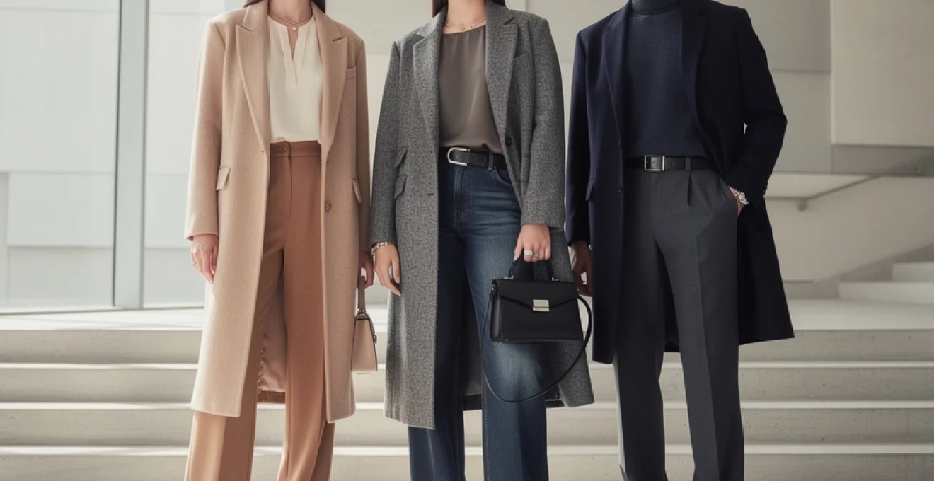
Mastering tonal gradation transforms a flat monochrome look into a dimensionally rich ensemble. The technique involves strategically placing lighter shades near areas you want to highlight and darker tones where you prefer to create shadow or definition. For instance, pairing a pale cream blouse with medium beige trousers and a deep caramel coat creates natural depth while maintaining cohesion. This ombré approach works particularly well for tall individuals seeking to create balanced proportions, as the gradual shift from light to dark prevents the jarring visual breaks that contrasting colors might create. Fashion houses have long utilized this principle, with recent runway collections showcasing everything from powder blue to navy gradations and soft pink to burgundy transitions.
Colour temperature dynamics: warm versus cool monochrome palettes
The temperature of your chosen monochrome palette dramatically affects the overall impression of your outfit. Warm monochrome schemes—think rust, terracotta, camel, and chocolate—evoke approachability, comfort, and organic elegance. These earth-toned ensembles photograph beautifully in natural light and complement warm skin undertones particularly well. Conversely, cool monochrome palettes featuring shades like ice blue, slate grey, charcoal, and navy project authority, precision, and modern sophistication. Understanding your personal coloring helps you select which temperature range will make your complexion appear most radiant. A simple test involves holding silver and gold fabric near your face—if silver flatters you more, cool tones are your ally; if gold wins, embrace warm monochrome palettes. The key lies in maintaining consistency throughout your ensemble, as mixing warm and cool versions of the same color disrupts the harmonious effect you’re aiming to achieve.
Visual elongation effects through Single-Hue dressing
One of monochrome dressing’s most celebrated benefits is its ability to create the illusion of height and streamlined proportions. This optical effect occurs because continuous color prevents the eye from stopping at horizontal lines created by contrasting garments. Research in visual perception confirms that uninterrupted vertical lines make subjects appear taller—a principle fashion designers exploit through monochromatic styling. For petite individuals, this technique proves particularly valuable, potentially adding the visual equivalent of several inches to perceived height. However, even those of average or tall stature benefit from the elongating effect, as it creates a more commanding, elegant presence. The impact intensifies when you extend the monochrome palette to footwear, eliminating the visual break that contrasting shoes would create at the ankle.
Psychological impact of monochrome: minimalism and cognitive processing
Beyond physical appearance, monochrome outfits influence how others perceive and remember you. Psychological studies on
attention and memory show that the brain processes simplified visuals more efficiently than complex, high-contrast compositions. A monochrome outfit functions almost like a clean logo: easy to register, easy to remember. This reduction in visual noise signals clarity, calm, and control, which is why single-colour looks are often associated with minimalism and quiet luxury. For you, this means a double benefit—others perceive you as more composed, and you experience less decision fatigue when getting dressed. In high-pressure environments such as presentations or networking events, this streamlined visual identity can subtly support your confidence and help your message, rather than your outfit, take centre stage.
Fabric selection and texture layering strategies
If colour is the language of monochrome outfits, then fabric is the punctuation that gives each look nuance and rhythm. Two people can wear the exact same shade head to toe and still look completely different depending on how they combine materials and textures. Thoughtful fabric selection is what prevents monochrome fashion from feeling flat, clinical, or unfinished. By mixing tactile elements—soft with structured, matte with lustrous—you create depth within a single hue, making the outfit feel intentional and luxurious rather than basic. This is where monochromatic styling moves from simple coordination into something closer to design.
Material contrast methods: mixing wool, silk, and cotton textures
Strategically contrasting materials within one colour family is one of the most effective ways to elevate monochrome outfits. Wool, silk, and cotton each reflect light differently and carry distinct visual weights, even when dyed the same shade. Imagine an ink-black silk blouse tucked into matte black wool trousers, topped with a brushed wool coat: the colour is consistent, but the outfit feels layered and complex. You can recreate this effect with more casual fabrics too—pair a crisp cotton shirt with a soft merino cardigan and structured twill trousers, all in tonal camel or grey. The trick is to let at least one fabric bring softness (like silk or fine wool) and another introduce structure (like suiting wool or heavier cotton) so your look appears considered, not monotone.
When planning material contrast, it helps to think of your outfit in three zones: base layer, mid-layer, and outer layer. Silk, viscose, or lightweight cotton make excellent base layers because they sit smoothly against the skin and act as a subtle light-catching surface. For mid-layers, reach for knits or brushed fabrics that add warmth and a slightly diffused texture. Outer layers—blazers, coats, structured dresses—benefit from firmer weaves like wool, ponte, or heavy cotton that hold their shape. Working within the same colour family across these zones allows you to build tactile richness while preserving the clean, uninterrupted impact that defines monochrome dressing.
Surface dimension techniques: matte, satin, and high-gloss finishes
Beyond fabric type, the surface finish of each piece profoundly influences how a monochrome outfit reads from a distance and in photographs. Matte fabrics such as brushed cotton, flannel, or crepe absorb light, lending an understated, almost architectural quality to your silhouette. Satin, silk, and sateen introduce gentle luminosity that catches movement and adds softness. High-gloss elements—think patent leather boots, lacquered belts, or vinyl accents—act like visual exclamation points within the same colour. When you combine these finishes, you are essentially painting with light and shadow using only one hue.
An effective formula is to choose one dominant finish and use the others as accents. For an office-ready navy monochrome look, you might rely on matte wool trousers and a matte knit, then add a subtle satin lapel or glossy leather loafers for contrast. For evening, reverse the proportions: a satin slip dress in deep burgundy under a matte wool coat, finished with patent heels in the same tone, delivers drama without breaking the colour story. Think of matte as your canvas, satin as your soft highlight, and gloss as the sharp flash that keeps the outfit from feeling too safe.
Structural fabric choices: tweed, denim, and knit combinations
Structural fabrics—tweed, denim, and heavier knits—play a crucial role when you want your monochrome outfits to feel grounded rather than delicate. These materials provide visible texture and form, which is especially useful in neutral palettes like beige, grey, or cream that can otherwise risk looking plain. A tonal grey ensemble, for instance, becomes far more interesting when you combine a fine-gauge knit, a slate denim skirt, and a charcoal tweed coat. The eye reads the interplay of texture before it registers any potential sameness of colour, giving you the best of both worlds: cohesion and character.
Denim monochrome looks have also become a street-style staple because they balance ease with edge. Wearing different washes of the same hue—a mid-wash blue jean with a slightly darker denim shirt and a soft chambray trench—creates depth without leaving the blue family. With tweed, you can let a single statement piece, such as a cream tweed jacket, anchor smoother knitwear and tailored trousers in matching tones. The key when mixing these more rigid fabrics with knits is proportion: allow at least one piece to have fluidity (like a draped sweater or wide-leg trouser) so the outfit feels wearable rather than overly stiff.
Weight variation principles for seasonal adaptability
Another often overlooked aspect of monochrome styling is fabric weight selection, which determines how effectively your outfits adapt across seasons. A successful monochrome wardrobe rarely consists of identical fabrics; instead, it spans a spectrum from featherlight to substantial, all within consistent colour stories. For example, if navy is a core colour in your capsule wardrobe, you might invest in a silk camisole, a lightweight merino sweater, a mid-weight wool blazer, and a heavy overcoat, all in closely related shades of navy. This range allows you to layer intelligently as temperatures change, maintaining the same elegant single-hue effect year-round.
Weight variation is also a subtle tool for shaping your silhouette. Lighter fabrics on top and heavier pieces on the bottom can visually anchor your frame and create stability—ideal if you feel top-heavy. Reversing that formula, with a substantial coat over a fine-knit dress or trousers, can add presence to a more petite build. As you experiment, ask yourself: does this combination feel balanced in both warmth and visual density? When the answer is yes, your monochrome outfit will not only look cohesive but also perform well in real life, from heatwaves to chilly commutes.
Architectural silhouette construction in monochrome wardrobes
Once colour and texture are working in your favour, the next frontier of powerful monochrome outfits is silhouette. Because a single-hue look naturally reads as one continuous shape, every seam, hemline, and volume shift becomes more noticeable. This is where fashion starts to resemble architecture: you are effectively sculpting space around your body using fabric. By consciously balancing proportions, integrating directional lines, and sequencing your layers, you can design silhouettes that flatter your frame and express your style with precision.
Proportional balance: oversized versus tailored garment pairing
Monochrome outfits make proportion play especially impactful because there are no competing colours to distract from shape. Oversized pieces feel even more intentional when paired with sharply tailored elements in the same shade, while head-to-toe slouch can start to read as unstructured rather than chic. A reliable guideline is to exaggerate only one dimension at a time. For instance, combine a voluminous cream knit with slim, ankle-length trousers in matching ivory, or wear wide-leg navy trousers with a neatly fitted turtleneck and blazer. The shared colour ties everything together, while the contrast of loose and fitted keeps your silhouette dynamic.
If you love the ease of relaxed fits, you can still embrace them in monochrome by anchoring at least one area of the body. A long, oversized coat in charcoal looks far more refined when worn over a streamlined column dress or cigarette pants instead of equally baggy separates. Conversely, a sharp monochrome suit becomes less severe when softened by a flowing silk blouse underneath. Ask yourself where you want structure and where you want movement; then assign tailored or oversized pieces accordingly within your chosen colour family.
Linear design elements: vertical and horizontal line integration
Line placement—whether vertical, horizontal, or diagonal—has an amplified effect in monochrome, because it subtly guides the viewer’s gaze within an uninterrupted field of colour. Vertical elements such as long lapels, centre-front seams, front pleats, or elongated scarves encourage the eye to travel up and down, reinforcing the elongating effect already inherent in single-hue dressing. This is why long monochrome coats, column dresses, and high-waisted trousers are such reliable tools for creating a taller, leaner impression.
Horizontal lines, by contrast, can either balance or truncate depending on where they sit. A tonal belt at the true waist can emphasise curves and create a classic hourglass effect, especially in head-to-toe black or navy. However, a strong horizontal break at the widest point of the hips or calves may visually shorten the legs, which you might want to avoid if height is a concern. Diagonal elements—wrap fronts, asymmetric hems, or angled pockets—offer a sophisticated middle ground, adding interest without starkly interrupting the vertical flow. When choosing monochrome pieces, look at the seams and hemlines as though they were lines in a drawing; their direction will have just as much impact as the colour itself.
Layering architecture: strategic garment sequencing for depth
Layering within a monochrome palette is where outfit construction becomes truly architectural. Because all pieces share a colour family, you can build three or even four layers without overwhelming the eye, provided the sequence makes structural sense. A useful approach is to move from most fitted to most structured as you work outward. Start with a close-fitting base layer (like a fine-knit top or slim dress), then add a slightly looser mid-layer (such as a cardigan or unstructured blazer), and finish with a more architectural outer layer (a coat, trench, or longline vest).
Varying lengths within those layers further enhances depth. A hip-length jacket over a longer tonal shirt and tailored trousers, all in soft taupe, creates visual steps that read as modern and intentional. In contrast, combining layers that all end at exactly the same point can make even an expensive monochrome outfit look blocky. Think of layering architecture as stacking simple geometric shapes in one colour: stagger them, overlap them, and adjust their volume so the final structure feels harmonious rather than heavy.
Iconic monochrome moments: from hepburn to contemporary runways
Monochrome outfits have marked some of fashion’s most memorable cultural moments, reinforcing just how powerful a single colour can be. Audrey Hepburn’s black Givenchy dress in “Breakfast at Tiffany’s” distilled the essence of monochrome elegance—no print, no complex palette, just impeccable cut and proportion. Decades later, Carolyn Bessette-Kennedy’s minimalist white and cream ensembles defined a new era of quiet luxury, influencing how we still imagine “effortless” style today. These looks endure in part because their limited colour palette makes them feel timeless, while details like neckline, hem length, and fabric do the storytelling.
On the runway, monochrome has become a recurring language for designers wanting to emphasise form over ornament. Brands from Jil Sander to The Row are renowned for their sculptural, single-colour silhouettes, while houses like Valentino and Balenciaga have sent models down the catwalk in saturated red, pink, or cobalt looks that read almost like moving colour fields. In recent seasons, head-to-toe tonal dressing has also dominated street style during fashion weeks, with editors and influencers favouring beige, chocolate, and pastel suits that photograph beautifully in natural light. When we borrow from these iconic moments, we are not just replicating outfits; we are tapping into a visual history that associates monochrome with confidence, modernity, and editorial-level polish.
Accessorising monochrome ensembles: metallics and statement pieces
Accessories are where you can personalise monochrome outfits without sacrificing their streamlined impact. Because your base look already feels cohesive, even a single statement piece—a sculptural necklace, a bold belt, or directional shoes—can transform the mood instantly. Metallic accents work particularly well with single-hue dressing, acting like highlights in a painting. Gold warms up camel, chocolate, and olive palettes, while silver or gunmetal enhances the cool clarity of black, navy, and grey. You can think of these metals as “neutrals with personality” that support rather than compete with your chosen colour.
The key is to decide whether you want your accessories to blend or to contrast. For a minimalist aesthetic, opt for tonal accessories: a cream bag with an ivory suit, or dove-grey boots with a slate ensemble. The effect is luxurious and quiet, ideal for work or formal settings. If you prefer more drama, introduce one focal accessory in a different finish or subtle accent colour—perhaps a snakeskin belt over an all-black look or a pair of rose-gold heels with a blush-toned outfit. Resist the urge to add too many competing focal points; in monochrome styling, one or two strong accessories are far more impactful than a scatter of small details.
Practical capsule wardrobe building with monochromatic foundations
Building a capsule wardrobe around monochrome foundations is one of the most efficient ways to simplify getting dressed while looking consistently polished. Instead of chasing every trend colour, you identify a few core hues—often one dark neutral, one light neutral, and one accent colour—that suit your skin tone and lifestyle. Within each of these palettes, you then assemble a small range of high-quality pieces across different categories: trousers, skirts, shirts, knitwear, outerwear, and shoes. Because everything lives within a tight tonal family, almost every item can be mixed and matched, dramatically reducing decision fatigue and impulse purchases.
A practical approach is to start with a base monochrome set in your most-worn neutral, such as black, navy, or camel. Invest in a tailored trouser, a versatile skirt, a blazer, a knit, and at least one dress in varying textures and weights within that colour. Next, build a lighter monochrome group—ivory, stone, or soft grey—for contrast and seasonal variation. Finally, add one accent monochrome story, perhaps in forest green, deep burgundy, or dusty blue, to inject personality without undermining versatility. Over time, you will find that even a 25–30 piece wardrobe can yield dozens of monochrome outfits, from business-ready to weekend casual, all anchored in coherence.
To keep your capsule functional, regularly review which monochrome outfits you reach for most and adjust accordingly. Maybe you discover that head-to-toe black feels too severe for your current role, but navy and charcoal hit the right balance; or perhaps you realise your all-white ensembles work best when you prioritise easy-care fabrics. Use these insights to refine future purchases, focusing on pieces that reinforce your core colour stories and fill genuine gaps. The result is a wardrobe that feels edited yet expressive—proof that when it comes to style, a strong monochrome foundation can be both simple and striking.